Maximizing the True Potential
Last week the Home Office and local Community Managers gathered together for the
reveal of Epoch’s refreshed brand. We have been working behind the scenes to
solidify our mission and vision as a company based on who we are today and where
we are headed in the future.
With that we have a new logo, brand color palette, font and perhaps one of the most
exciting elements is the new website! Check it out at www.epochresidential.com. As
there are numerous moving parts and pieces to a new website, we are still making
some updates.
As we move through the transition you will notice updates to our e-mail signature
blocks, our social media accounts and much more.
An important part of this journey was discovering our brand values and brand filters,
the beliefs in which we as a company hold ourselves accountable to. We look forward
to sharing more details on those elements in the coming weeks.
We hope you share our excitement in these updates and thank you all for your Epoch
Pride! Please scroll down to discover our new brand!
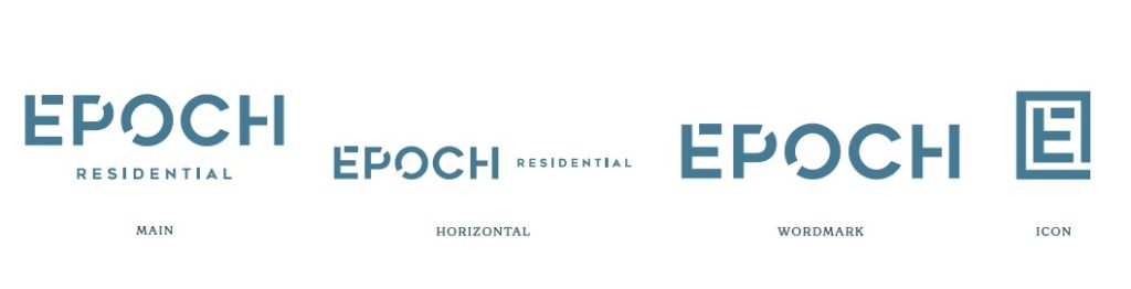
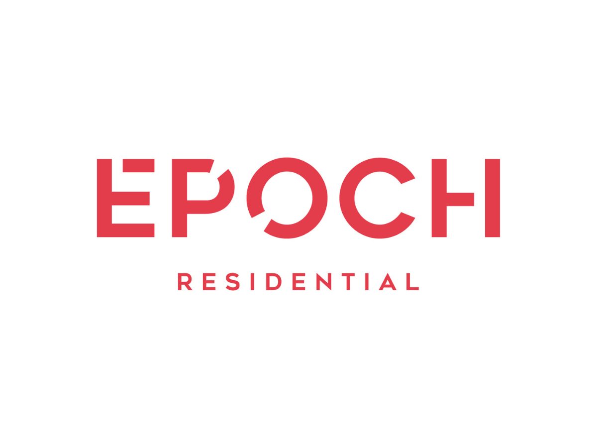
Here you will see the new logo in 3 different variations as well as a single E icon.
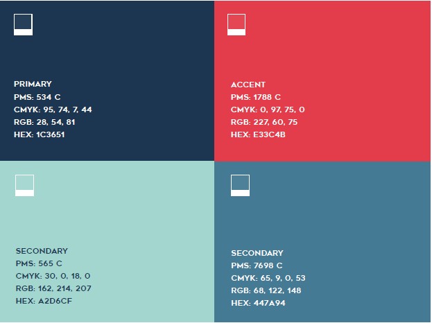
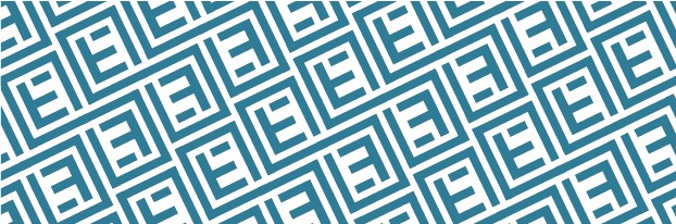
A professional dark navy blue is paired with an approachable lighter blue and bright turquoise with a bold pop of red, all representing different facets of Epoch Residential today. Additionally, a custom pattern for added texture and depth where applicable.
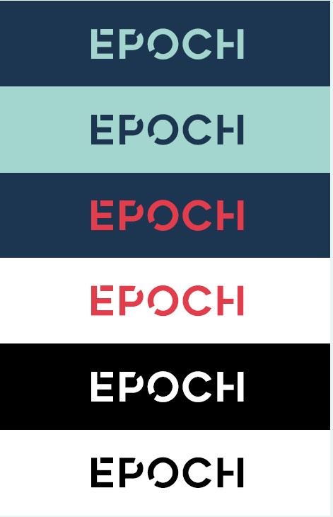
The logo can be used interchangeably within the color palette in the following ways.
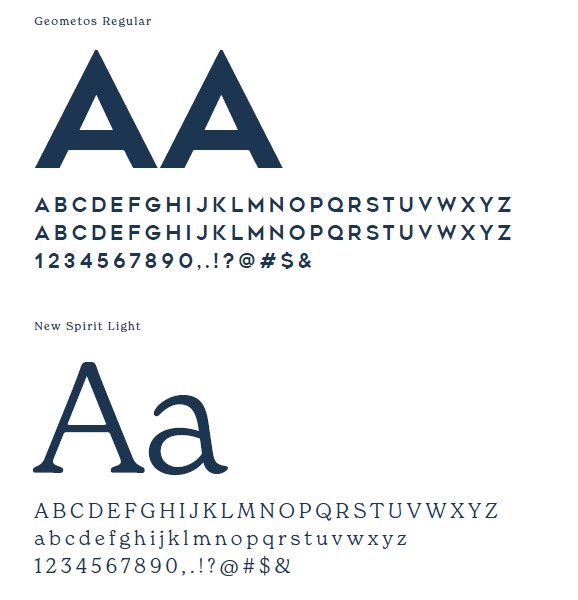
Our new fonts are Geometos and New Spirit Light. These will be used on the website and any
printed collateral.